Portfolio
Poder DesenvolverEncouraging independence, transforming lives
The brand of a family-centered, evidence-based practice: care in the symbol, development in the colors, independence in the name.
Brand · Health and child development · 2023
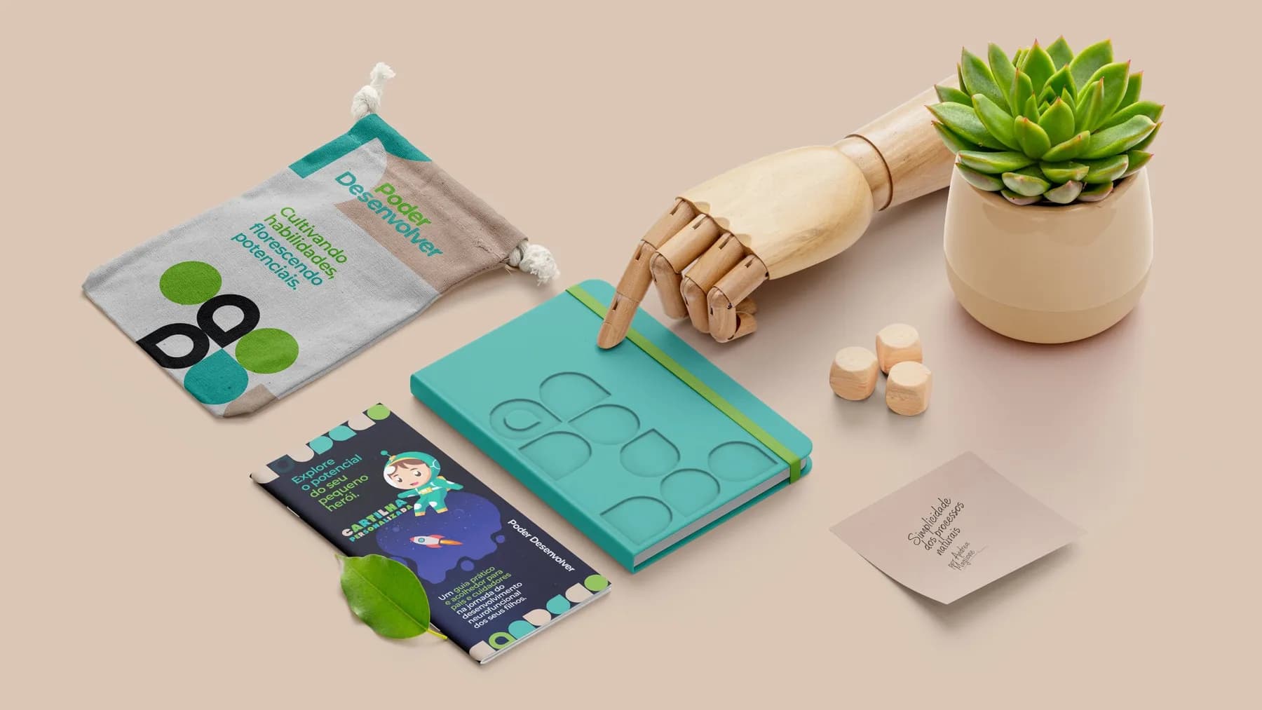
Services delivered
- Concept
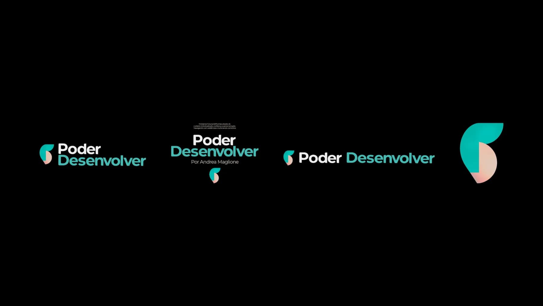
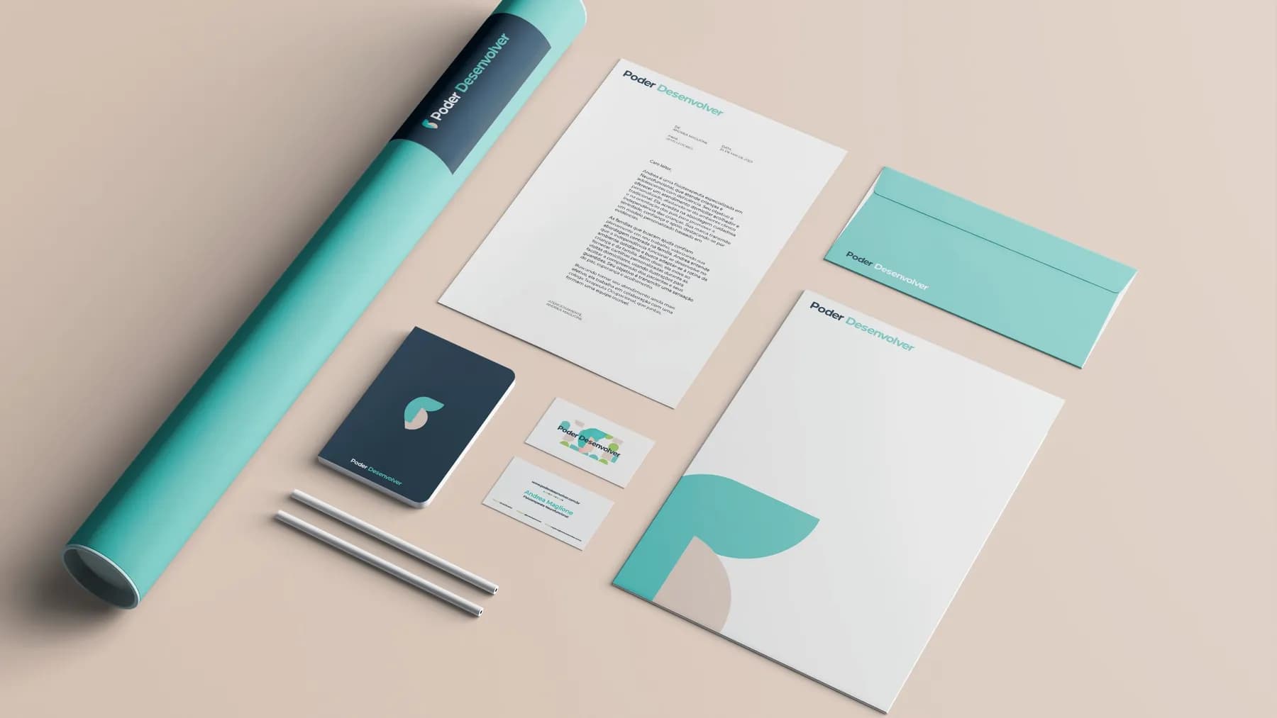
- Logo and symbol
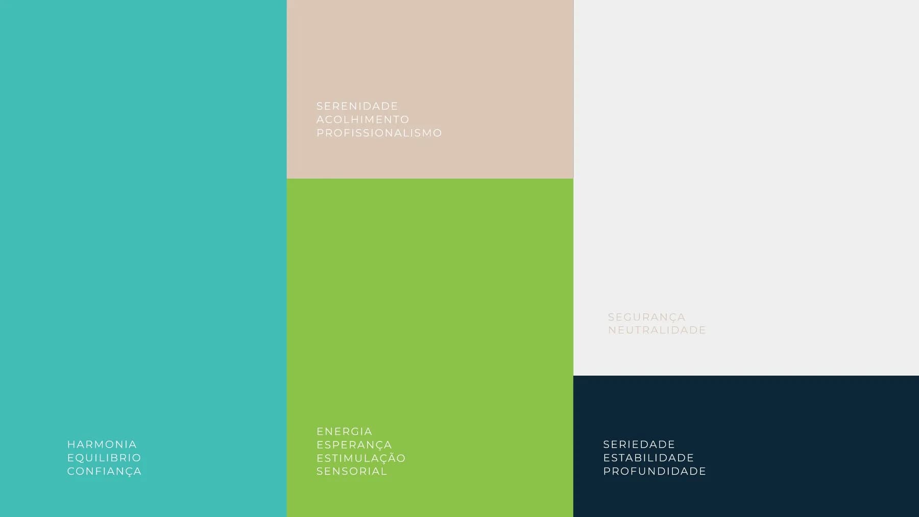
- Colors and typography
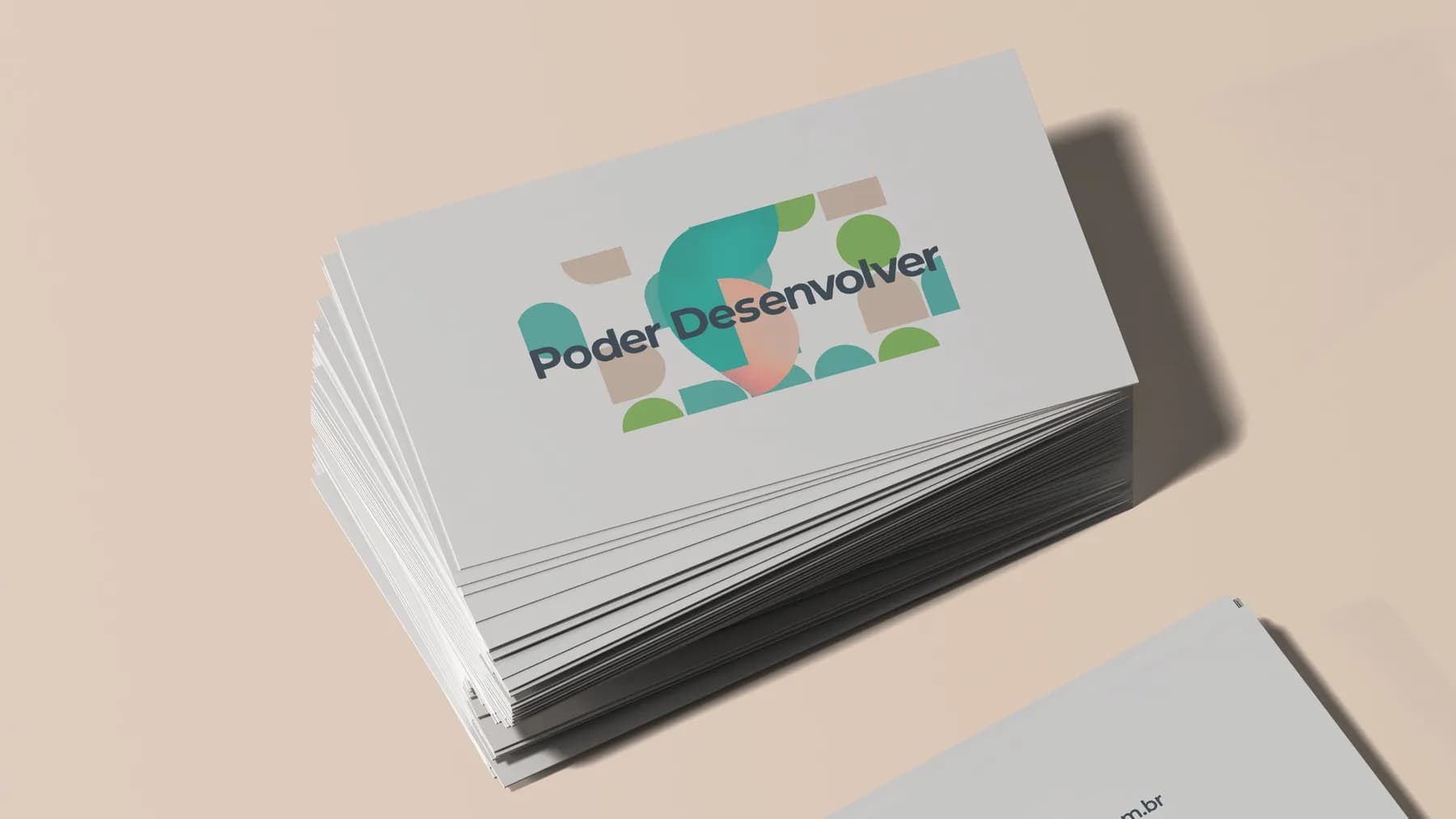
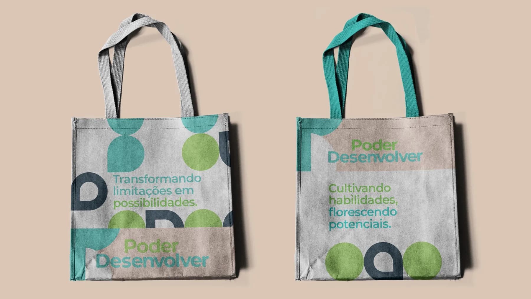
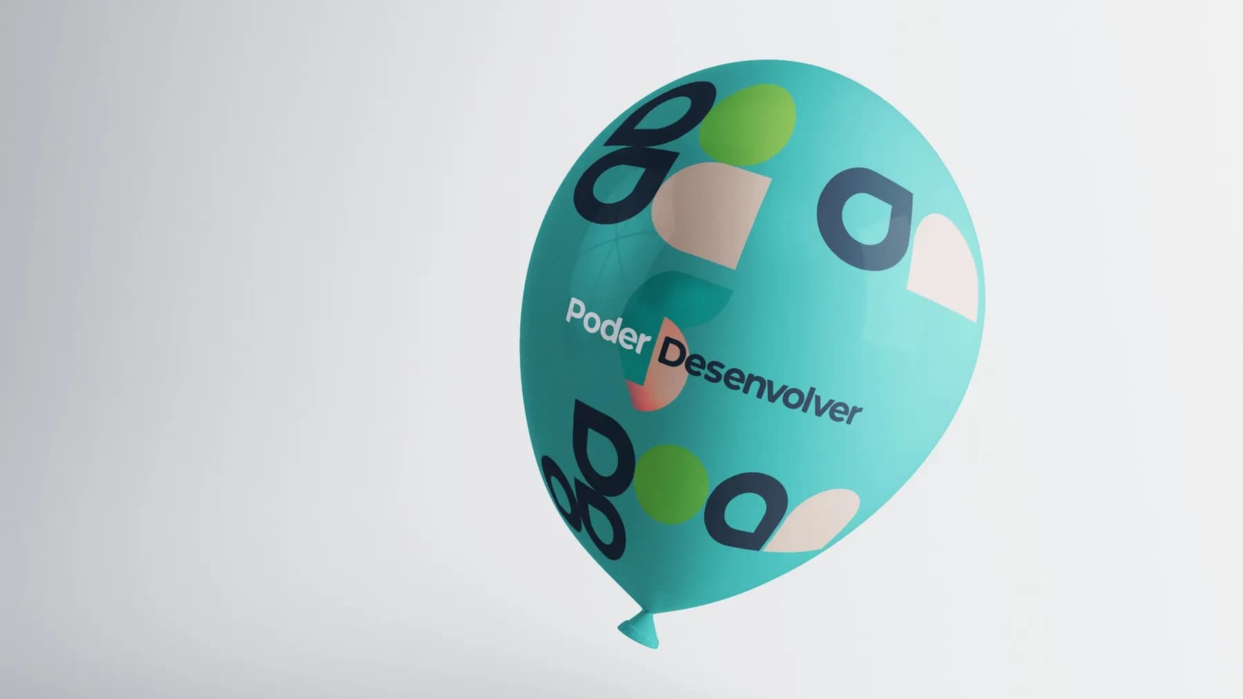
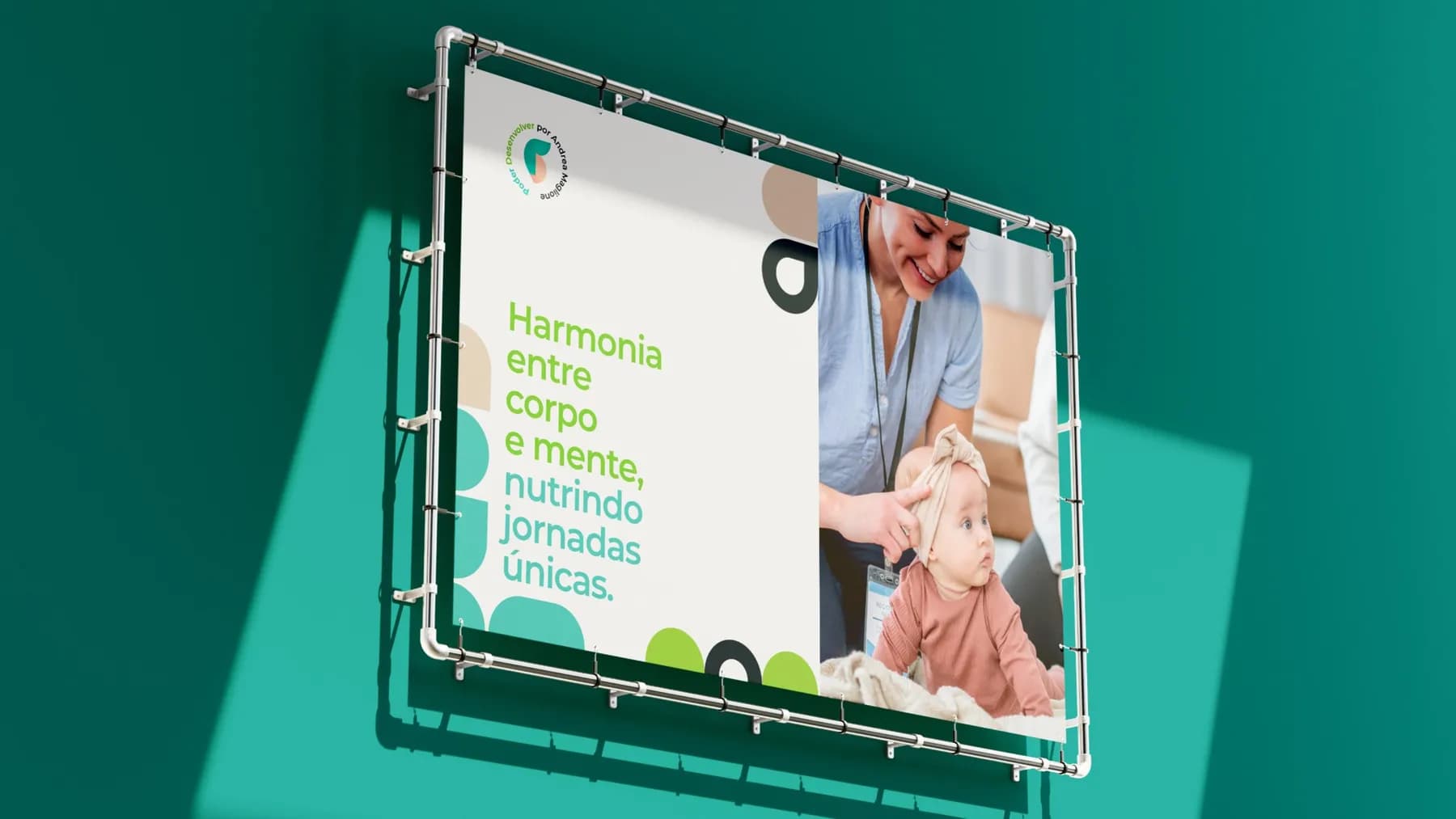
- Patterns
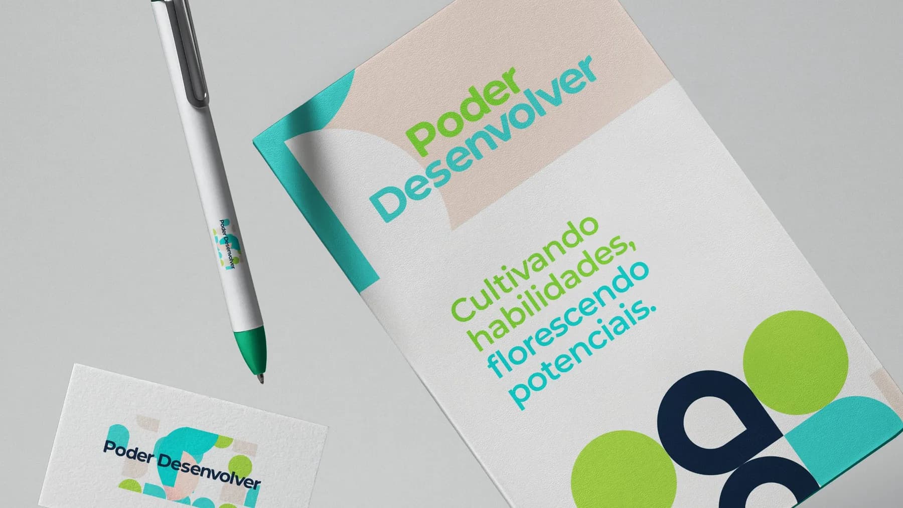
- Stationery
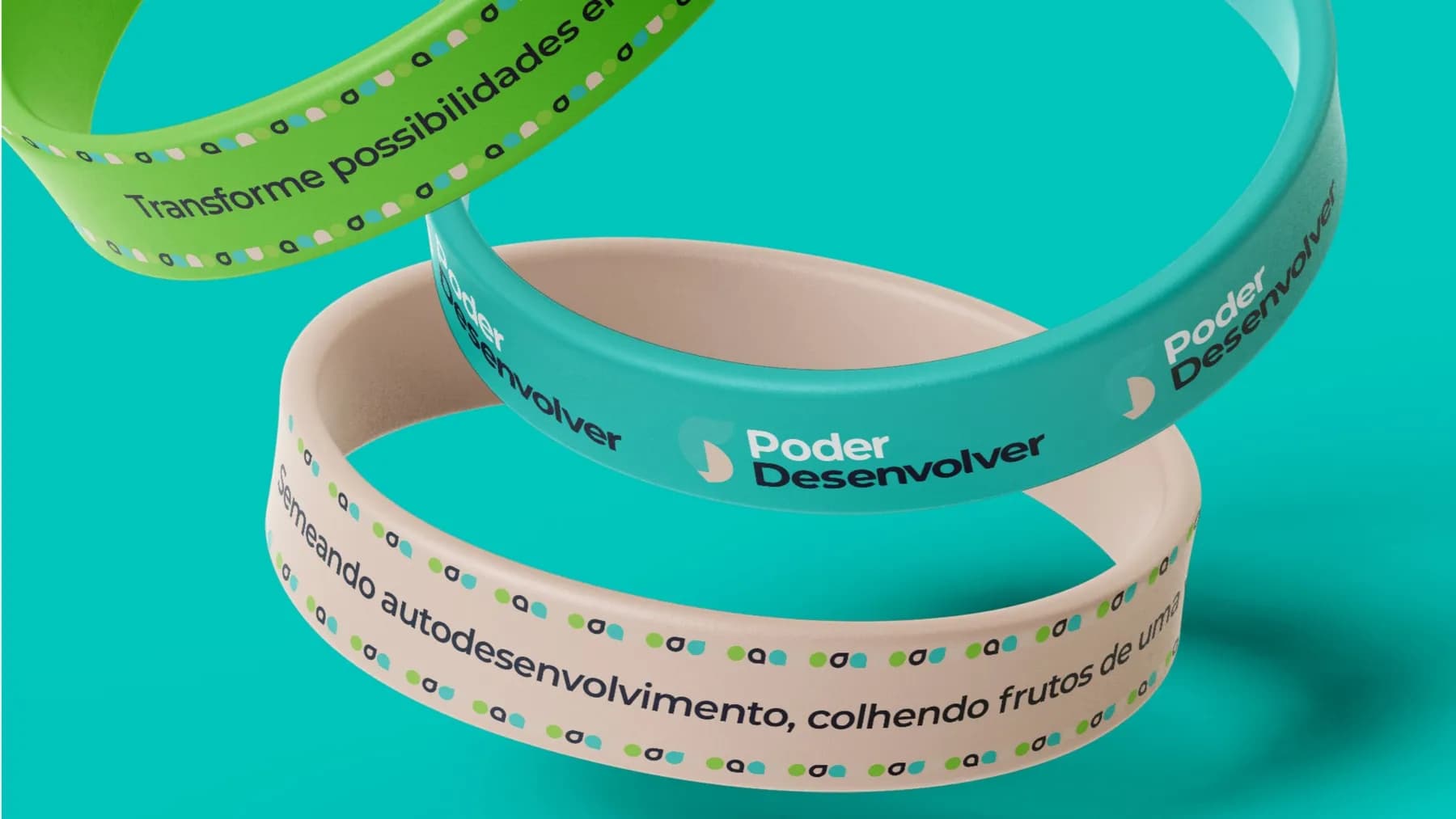
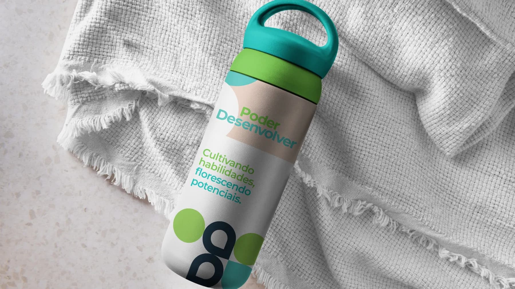
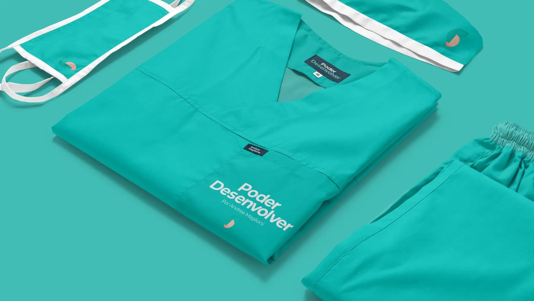
- Uniforms and merchandise
Challenge
Create the brand of a family-centered, evidence-based practice that feels welcoming without losing clinical seriousness.
Solution
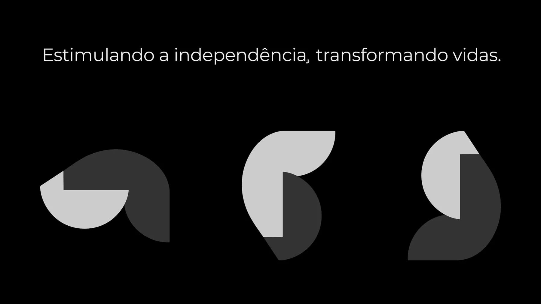
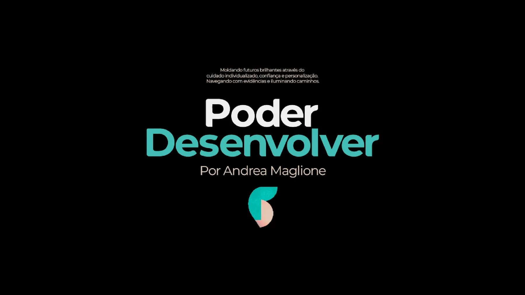
We started from a question: what is the difference between an ordinary seed and a lush plant? None; development happens in the right environment. The symbol is an embrace that forms the P and the D, the colors tell the story of development and a sans-serif typeface brings lightness and legibility.


You talk to the people doing the work
Want a brand built with this much care?
Tell us what you do. We reply with the path for your case, the timeline and a fixed price in writing before we start.